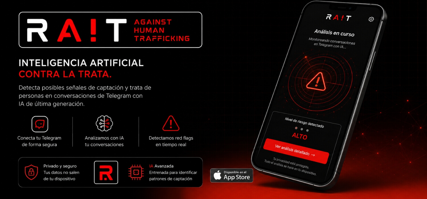
RA!T (Red-Flag Artificial Intelligence Against Human Trafficking) is an innovative AI tool developed for Diaconía España to detect grooming patterns and human trafficking red flags in Telegram messaging channels. As Lead Designer at Diaconía España, I designed the complete visual identity system—including naming architecture, a typographic logotype where the red exclamation mark doubles as the “I” in AI to highlight smart alert detection, dark-mode brand guidelines, and UI/UX conceptual mockups to guide application development.
- Diaconía España - Mujer y Lucha contra la trata
- 2024
- Madrid, Spain
RA!T AI Anti-Trafficking Brand Identity
Visual Identity, Naming Architecture & Concept UI/UX
- Role: Lead Brand & Security Visual Designer (In-House at Diaconía España)
- Deliverables: Brand Naming Architecture, Logotype & App Icon Mark, Brand Guidelines & Visual System, Dark-Mode UI/UX Concept Mockups & Presentation Assets
- Tools: Illustrator, Photoshop, CANVA
About the project
1. The challenge of RA!T AI Anti-Trafficking Brand System
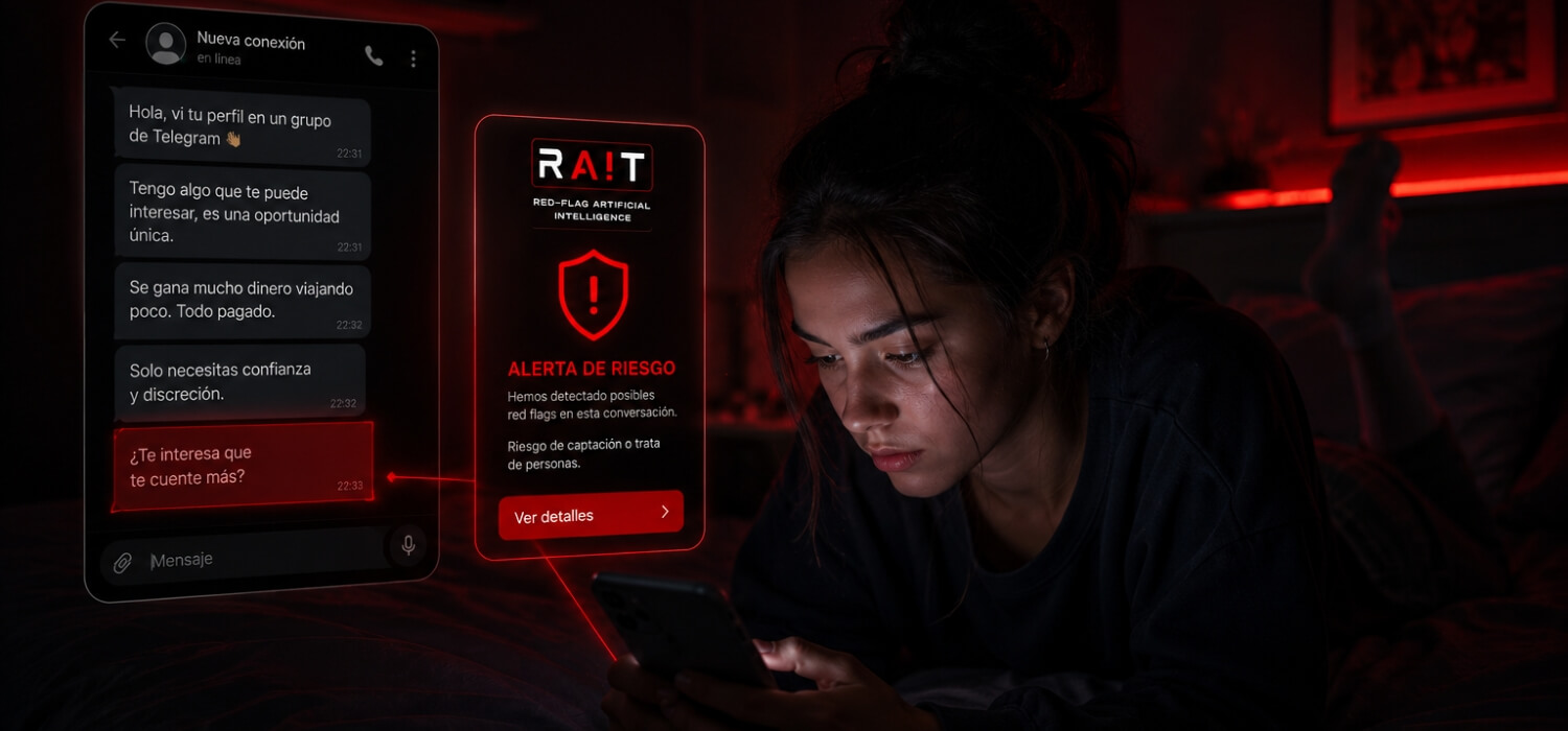
Digital messaging platforms like Telegram have increasingly become discreet channels for criminal networks engaging in online recruitment, grooming, and human trafficking. To combat this, Diaconía España commissioned RA!T—an AI-driven monitoring tool designed to analyze chat conversations in real-time, flag suspicious patterns (unrealistic financial promises, isolation attempts, urgent pressure), and alert users before exploitation occurs. The branding challenge was creating a tech-focused, trustworthy, and urgent visual identity that conveyed cybersecurity authority while maintaining user accessibility.
2. Creative Process & Solution
Developed directly within Diaconía España, the design strategy focused on cyber-protection, artificial intelligence, and instant risk awareness:
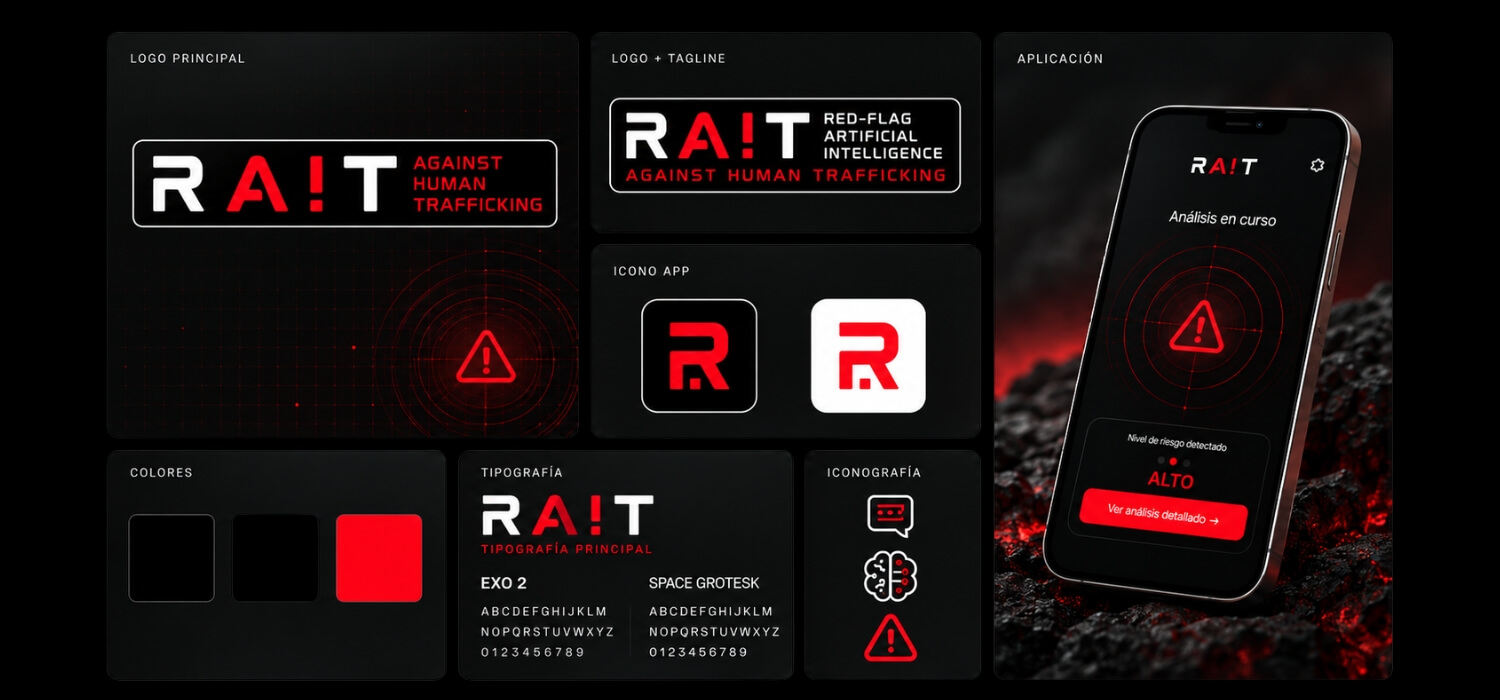
- Conceptual Naming & Logotype Lockup: Integrated a vivid red exclamation mark (!) into the RA!T acronym. This element fulfills a dual purpose: it signals immediate threat alerts while visually forming the letters A! (AI) to highlight artificial intelligence at the core of the tool. A secondary compact app icon was created using an engineered “R” monogram inside a rounded container.
- Tech-Driven Typographic Selection: Selected futuristic, tech-oriented typography—pairing geometric display sans Exo 2 for headlines and logos with technical monospace UI typeface Space Grotesk—to reinforce cybersecurity, data analysis, and technological precision.
- High-Contrast Dark Mode Palette: Combined a stark black background (#000000) with vibrant signal red and crisp white. This high-contrast aesthetic mirrors modern cybersecurity tools while optimizing readability during discreet mobile use.
- Tech-Driven Line Iconography: Created a custom vector icon set representing radar analysis, neural AI networks, encrypted privacy shields, and risk alert levels.
3. Conceptual UI/UX Application
While the backend AI software was engineered by technical partners, I designed the visual concept and UI layout guidelines to define the user experience:
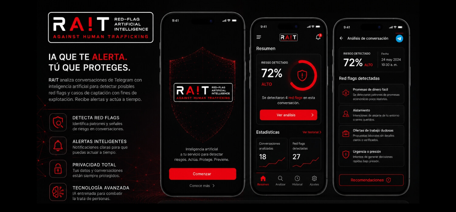
- Risk Alert Interface: Designed conceptual screens illustrating how the app flags messages in real-time with visual indicators (e.g., 72% High Risk Level) and contextual threat breakdowns.
- Privacy & Security Touchpoints: Ensured visual framing reinforced that message processing remains encrypted and device-bound, building user trust.
4. Impact & Results
The RA!T brand system successfully gave Diaconía España a cutting-edge visual platform to present their AI research and tool prototype across social impact summits, technical reports, and developer briefs. The visual framework set a clear blueprint for turning complex AI data into a life-saving digital interface.